
4 Most Common Rejection By USPTO or PCT
- Dipika Shaw
- Nov 5, 2022
- 3 min read
Its been almost 15 years working on patent drawings. I have worked on thousands of cases. When a new invention requires every view from scratch, many times the client approaches me with drawings rejected by USPTO (The United States Patent and Trademark Office) or PCT (Patent Cooperation Treaty - The International Patent System - WIPO). While working on these Office Actions and Invitation to correct defects, I realized, there are most common rejections, for example, small text height, blur drawings, poor line quality, drawings going out of the margins, inconsistent views etc.
There are some basic guidelines from the USPTO and PCT about how to create the drawings for patent filing. Well, their guidelines are so descriptive that it is sometimes difficult to understand the basic requirements. In this article, I tried to emphasize 4 basic rejections. Hope this will help the inventors and other illustrators to create the drawings to overcome those rejections. The 4 Most Common Rejection By USPTO or PCT are as follows:
Sheet Margin Rejection
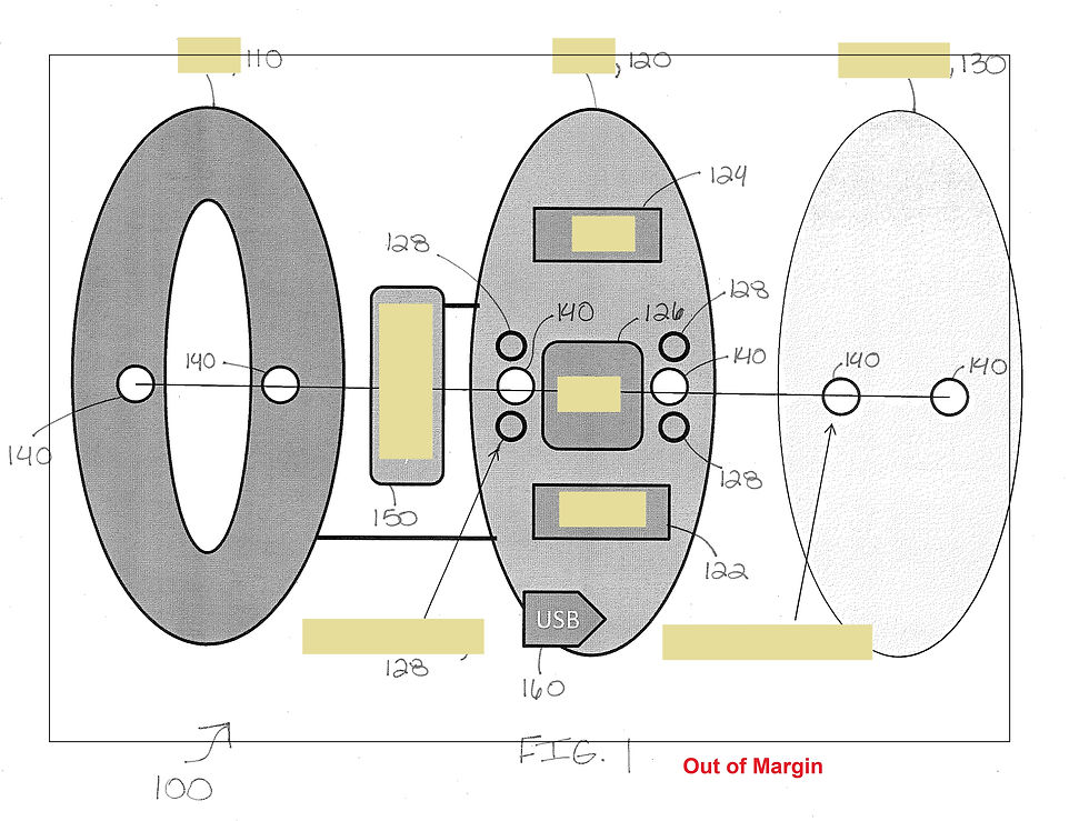
A very common rejection is the drawing out of the margins.
Here are the guidelines:
A4 Sheet or Letter -
top margin - 2.5 cm (1 inch),
left-side margin - 2.5 cm (1 inch),
right-side margin - 1.5 cm (5/8 inch),
bottom margin - 1 cm (3/8 inch)
Before creating the drawings for patent filing, it is always better to create your own template with the required margins.
Scale up or down the required drawing to make a fit into the borderline. Also, it is always good to use the entire sheet space wisely to give a good quality view.
Line Quality
Another common rejection from PTO (Patent and Trademark Office) is the poor line quality of the drawing.
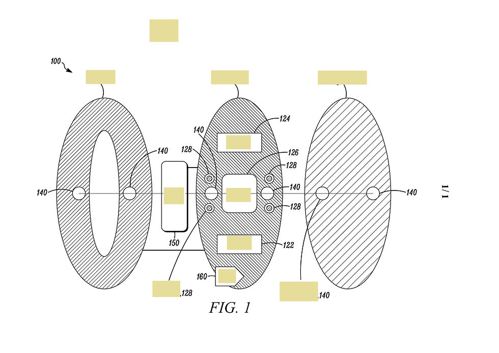
PTO has guidelines about the coloured images used. To minimize the use of ink, it is better to use the drawings in the line art form.
Also, drawings need further reproduction, therefore, it is necessary for the drawings to be clear and with uniform line thickness. The lightest weight of the line used for even shading should not be less than 0.1mm.
Text Height
The most common rejection I came across is the small text height. As per PTO guidelines, the height of the letters should not be less than 0.32 cm.
Well, to overcome this rejection, it is always better to use the letter heights of point 12 or more. If you are creating drawings in AutoCAD, it is always better to use text height of 0.13"


Grayscale Drawings
One more very common drawing objection by PTO is the grayscale drawings. Coloured drawings are allowed in the patent filing are those in which the colour of the invention matters. For example, the heat maps, or any chemical treatment in which there is a change in the texture of the product. Below is an example in which grayscale drawing is allowed.
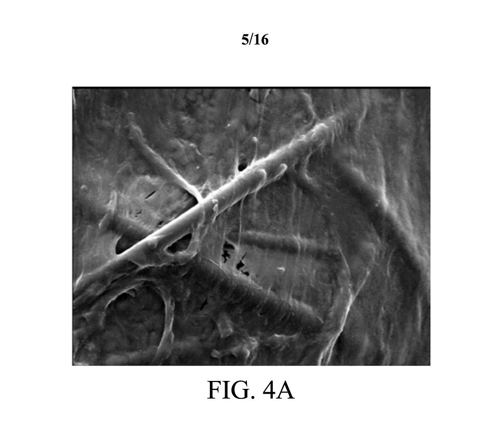
An example where a coloured drawing is allowed.

If a drawing can be shown with lines, then the PTO will object to the grayscale drawings. So, it is always better to create the line art form of the drawings.


If you follow these guidelines, it will save your patent from rejection and save your efforts for reapplying and the cost of illustrating them again.
There are a few more rejections like inconsistency in the views, reference numbers marked in the drawings which are not mentioned in the drawing specification, the wrong orientation of view etc. I will cover them in my next article.
If you need any assistance in illustrating your patent drawings you may drop me an email at info@desillus.com or call me at +1-647-403-7719
Comments